How to read the graph
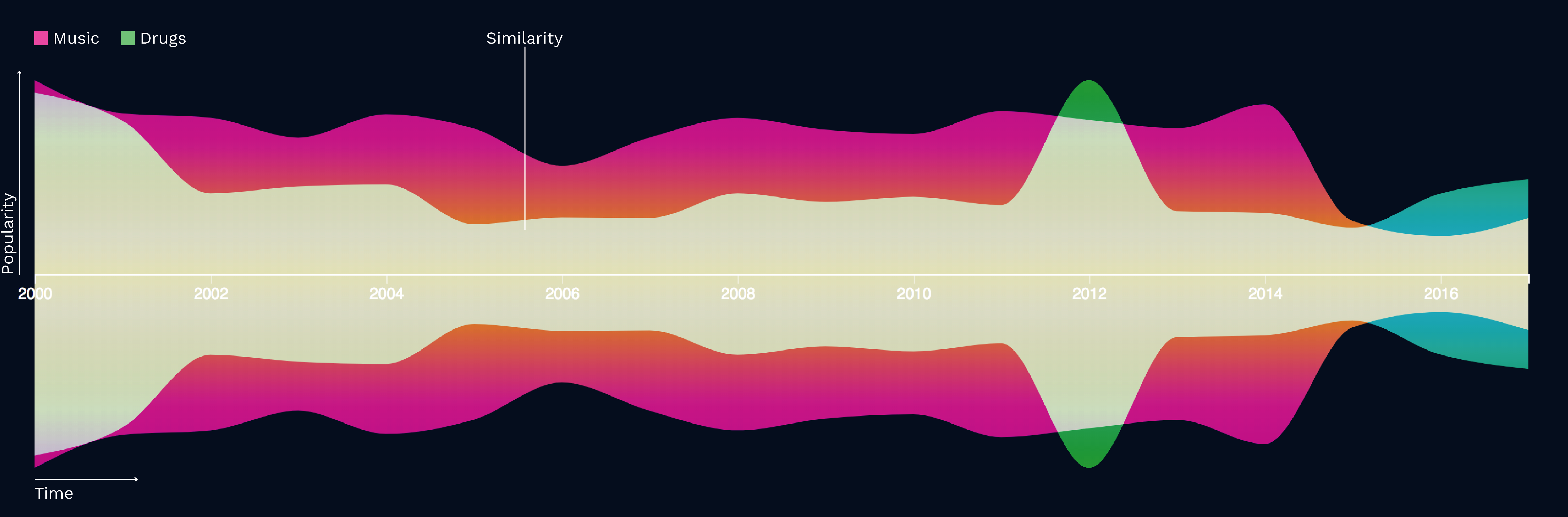
The visualization displays the correlation between popularity in music genres and drugs over the last 17 years. The goal was not to prove facts, but rather to let the viewer discover certain similarities and stimulate thoughts on what could have happened in a specific year. We chose two overlaying curves* to visualize the correlation.
Green shows a certain drug, whereas red is a music genre. The X-axis represents time. Our visualization starts in 2000 and ends in 2017. The Y-axis shows the popularity in that specific year.
We used a formula called the Pearson Correlation to calculate the similarities between our music genres and drugs. We converted the numeric output to five different expressions:
- very similar curve
- slightly similar curve
- neutral correlation
- slightly converse curve
- very converse curve
*Each popularity curve was normalized in order to display the correlation visually more clear.